Sleep Widget
Utilizing Bevel forum data, I designed a conceptual sleep widget that sythesizes trending user suggestions and Bevel's existing sleep tracking information interface.
The Idea.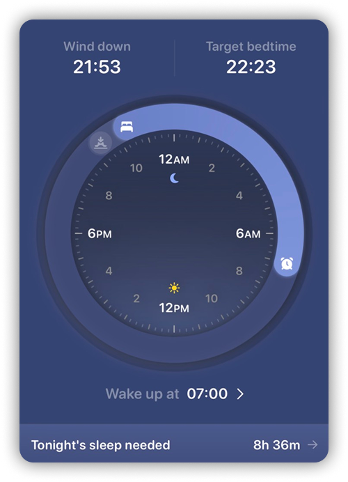
Bevel is a popular health and wellness application that provides users with a variety of tools to track and improve their sleep. I wanted to design a sleep widget that would provide users with a quick and easy way to access their sleep data and insights. I used user feedback from Bevel forums to help navigate my design decisions and ensure that the widget would meet the needs and preferences of Bevel users.
The Process.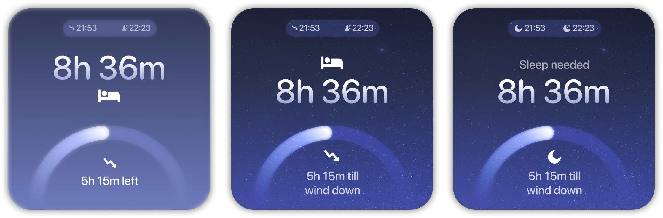
Iteration
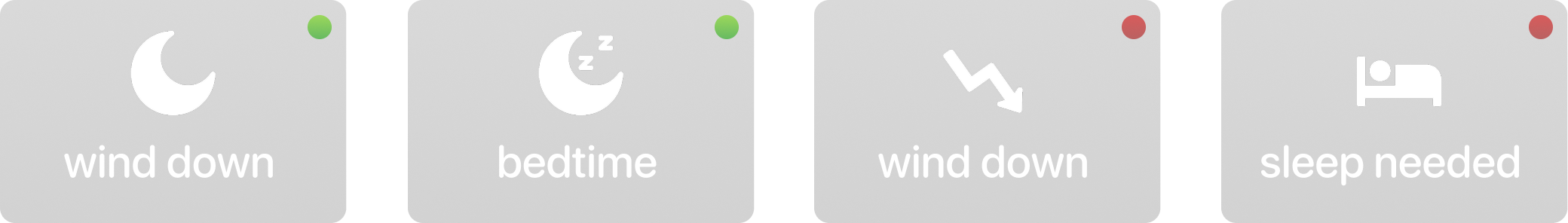
As with any design process, iteration is key. I went through multiple iterations of the sleep widget design, led by user observation tests and feddback sessions to inform any updates. A specific challenge I encountered was the various degrees in which icons can communicate an intended meaning. I found that, in my early designs, users misinterpreted some icons as irrelevant or confusing. In response, I refined the icons to be more intuitive and aligned with user expectations. This process taught me the importance of user feedback and iteration in the design process, and how small details can have a big impact on the overall user experience.
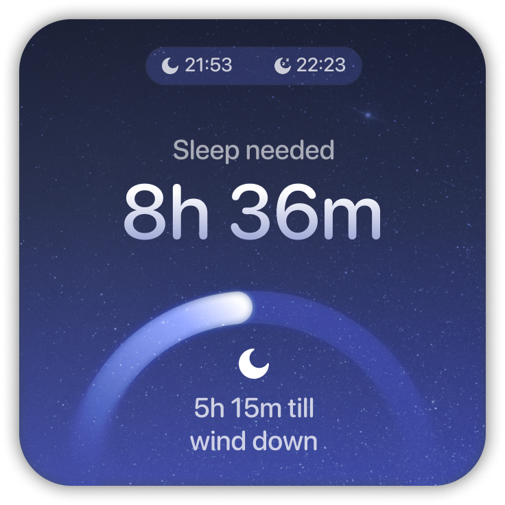
The Breakdown.