Widgets
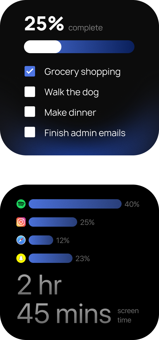
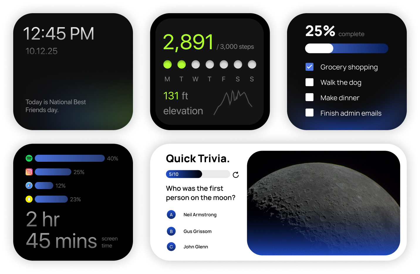
A collection of ios widget designs that produced interesting challenges regarding presentation of information and maximizing functionality
The Idea.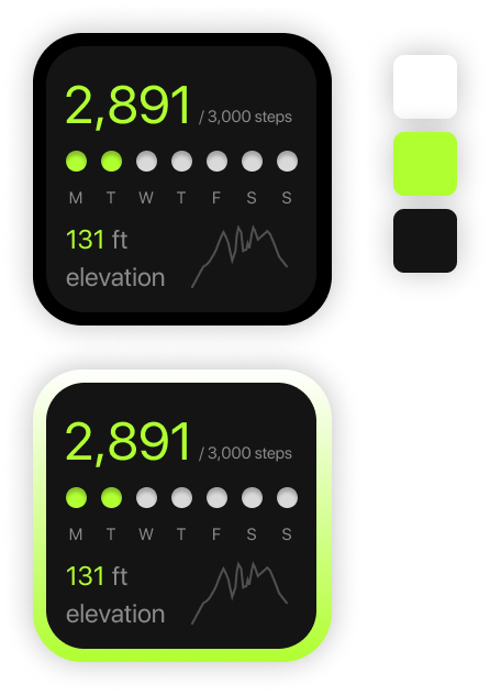
I thought it would be an interesting challenge to work with restricted space, while presenting information in a digestable format. Each widget had unique obstacles. This project enchanced my methods for solving problems while excercising my eye for aesthetics. I wanted to push my typography skills in this project, and work from scratch with only a short task description for reference. Working with limited space created new opportunities for growth and allowed me to think outside of the box.

The Process.

Skills
UX/UI design, frontend development, backend development, user research, wireframing, usability testing, database architecture.
Tools & Frameworks
Figma, Python, Swift, SQl, Git, Adobe Photoshop, Postgres, Github Adobe Illustrator, Tailscale.
The Breakdown.